Why 'Edge Cases' Are Actually Your Primary Market
2025 | 4 months long
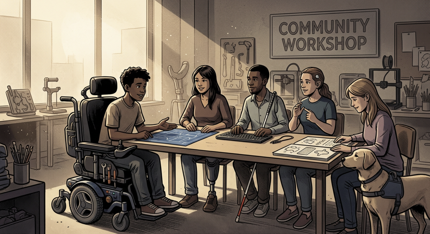


The app would have followed standard accessibility guidelines (contrast, font size, voice options) but still overwhelmed users with infinite choice, making them too anxious to engage. The design would have been technically accessible but functionally unusable for a portion of the target population.
SOLUTION
Based on observations revealed in focus groups, I capped every screen at four interactive buttons to keep choice manageable rather than overwhelming.
Voice activation, signaled by high- contrast red bubbles, let users who struggled with typing, reading, or eyesight participate on equal footing.
Pairs loaded the interface together rather than alone, reducing solo anxiety and creating immediate peer connection before the activity even began.
Psychological Warning Indicators
Technically Accessible but Functionally Unusable
Without this shift, the app would have followed every standard accessibility guideline and still be limited. Thus the design would continue to exclude certain people.
By capping choice instead of just expanding access, users who had frozen on open- ended prompts were able to complete the activity, the final concept was presented to the Sony client team.
IMPACT
Focused on the target population (isolated individuals) but in doing so, didn’t realise that there were edge cases who were being excluded by my initial design